
The Psychology of Colour

Brand Psyche | Volume 1
"Colour is often the first conversation your brand has with a potential customer. The question is: what is it saying?"
Reading Time: 4 minutes
Introduction
Imagine walking into two cafés.
The first is painted in bright primary colours. Every surface competes for your attention. Neon signs flash in the windows, handwritten chalkboards crowd the entrance, and every wall introduces another bold shade.
The second café feels different.
Warm oak tables, soft beige walls, natural light and muted stone finishes create a calm atmosphere. Nothing is loud, yet everything feels considered.
Before you've taken a sip of coffee, you've already formed an opinion about both businesses.
One feels energetic.
The other feels refined.
Neither impression came from the quality of the coffee.
It came from the way your brain interpreted colour, light and visual cues.
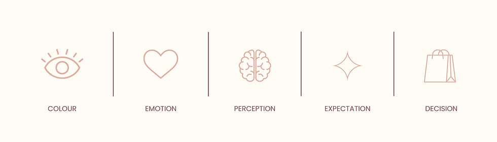
Colour isn't merely decoration. It is information. Long before we consciously evaluate a brand's products or services, our brains begin building expectations based on what we see.
This is why colour deserves more than a place at the end of the design process. It is one of the earliest signals people use to decide whether a brand feels trustworthy, premium, approachable or exciting.
Section 1
Colour Is Information
Human beings evolved to interpret colour long before we developed written language.
A shift in colour could signal changing seasons, ripening fruit, clean water, danger, or disease. Our brains became remarkably efficient at extracting meaning from visual information because doing so improved our chances of survival.
Today, that same mental shortcut influences how we experience brands.
Psychologists describe many of these rapid mental shortcuts as heuristics. Rather than analysing every piece of information from scratch, our brains rely on patterns to make quick judgments.
Colour is one of those patterns.
When we encounter a new brand, our brains don't consciously say:
"This particular shade of navy increases perceived trustworthiness."
Instead, they make an almost instantaneous assessment:
"This feels professional."
or
"This feels playful."
These impressions often occur before we have consciously processed a headline or read a single sentence.
This phenomenon is closely related to emotional priming.
Emotional priming occurs when one stimulus subtly influences our emotional state before we evaluate something else. Colour can help create that initial emotional context, shaping how we experience everything that follows.
Importantly, colour rarely works in isolation. Typography, photography, layout, texture, lighting and language all contribute to the overall perception. Colour is one instrument in a much larger orchestra.
Section 2
Why brands choose certain colours
One of the biggest misconceptions in branding is that colours have fixed meanings.
You've probably heard statements like:
Blue means trust.
Green means sustainability.
Red creates urgency.
While these associations can sometimes be useful, they're far from universal.
Context changes everything.
A deep navy used by a private wealth firm communicates something very different from the same navy used by a children's toy company.
Likewise, emerald green may suggest nature in one context and luxury in another.
This is why successful brands don't choose colours because a chart told them to.
They choose colours because they support the perception they want to create.
Why luxury brands often choose neutrals
Many luxury brands rely on restrained colour palettes featuring black, white, cream, charcoal or muted earth tones.
This isn't because neutral colours are inherently luxurious.
Instead, neutral palettes often reduce cognitive load. With fewer competing visual elements, the brain can process the design more fluently. Psychologists refer to this as processing fluency: when something is easy to process, people often perceive it more positively.
Combined with generous whitespace, refined typography and high-quality imagery, a restrained palette can contribute to a sense of confidence and craftsmanship.
Brands such as Apple, The Row and Aesop all demonstrate how simplicity can create a distinctive premium identity. Notice, however, that their colour palettes are only one part of a much larger design system.
Section 3
Applying Colour Psychology to Your Own Brand
Choosing colours should never begin with the question:
"What's my favourite colour?"
Instead, begin with a different question:
"How do I want people to feel when they experience my brand?"
Perhaps you want your business to feel:
Calm
Sophisticated
Innovative
Friendly
Energetic
Grounded
Once you've defined the desired emotional outcome, your colour palette becomes a strategic decision rather than a personal preference.
It is also important to remember that consistency matters.
A carefully considered palette applied consistently across your website, social media, packaging and printed material strengthens recognition over time. Colour becomes part of your brand's memory structure, helping people recognise you before they even read your name.
Ultimately, colour should support your positioning, not compete with it.
Brand Takeaways
Colour influences first impressions before words are processed.
There are no universal colour rules. Context always matters.
Choose colours based on the perception you want to create, not simply on personal preference.
Further Reading
Books
Thinking, Fast and Slow by Daniel Kahneman
The Design of Everyday Things by Don Norman
How Brands Grow by Byron Sharp
Brand Thinking and Other Noble Pursuits by Debbie Millman
Researchers & Authors
Daniel Kahneman
Donald Norman
Jennifer Aaker
Byron Sharp
Angela Wright (colour theory)
Eva Heller (Psychology of Colour)
Academic Reading
Labrecque, L. I., & Milne, G. R. (2012). Exciting Red and Competent Blue: The Importance of Colour in Marketing.
Elliot, A. J., & Maier, M. A. (2014). Colour Psychology: Effects of Perceiving Colour on Psychological Functioning
Final Thoughts
Colour is one of the earliest conversations your brand has with the world.

It quietly shapes expectations before a customer has read your headline, explored your website or experienced your service. Yet colour alone is never responsible for a brand's success. It works alongside typography, imagery, language and consistency to create an overall perception.
The most memorable brands don't choose colours because they're fashionable or because a chart claims they inspire trust. They choose colours with intention, ensuring every visual decision supports the story they want people to believe.
Because in branding, perception doesn't begin with words.
It begins the moment someone looks.


Comments